Mastering Color Harmony in Your Closet
Unlock effortless outfits with color harmony. Build a palette, balance undertones, and use smart formulas to mix, match, and shop with confidence.
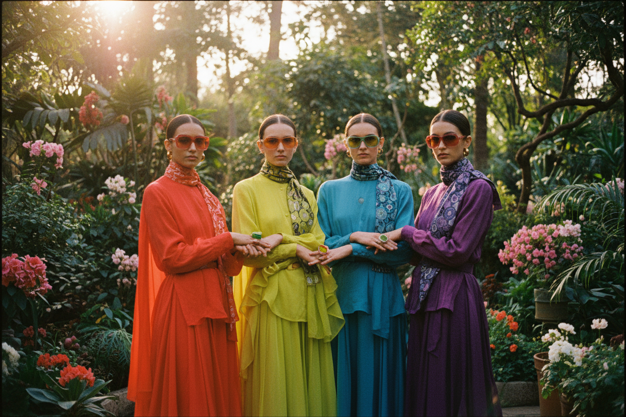
Color Foundations
Color harmony starts with understanding the color wheel and how hues relate to one another. Learn the difference between hue, saturation, and value: hue is the color family, saturation is intensity, and value is lightness or darkness. When you combine these thoughtfully, outfits feel intentional rather than improvised. Explore complementary pairings for bold energy, analogous blends for effortless flow, triadic schemes for lively balance, and monochrome for sleek minimalism. Consider your undertones—warm, cool, or neutral—because they influence how colors reflect on your skin and interact with your features. A soft, cool palette may invite slate, dusty rose, and charcoal, while warm palettes thrive with camel, terracotta, and olive. Test with a simple drape method by holding garments near your face in natural light. Notice whether your eyes brighten or your complexion appears vibrant. The goal is not rules for rules sake, but a toolkit that makes color pairing feel natural, expressive, and repeatable.
Build a Cohesive Palette
A harmonious closet grows from a focused set of neutrals and intentional accent colors. Choose two or three base neutrals—think navy, charcoal, ivory, or taupe—to anchor most looks. Add two or three accents that play nicely with those foundations, such as sage, cinnamon, or cobalt, creating a flexible capsule effect. Aim for fabrics with similar weight or drape so colors blend seamlessly in outfits. Texture matters too; matte cottons and airy linens mute brights, while satin or leather sharpens them. Create a swatch card with fabric snippets or photos to guide shopping decisions and reduce impulse buys. If a new piece complements at least three items you already own, it earns a spot. Over time, you will notice fewer dead-end garments and more mix-and-match options. This deliberate approach turns color from a gamble into a reliable system, making every morning faster, more creative, and confidently consistent.
Proportion and Contrast
Even the best palette needs thoughtful proportion. Use the 60-30-10 rule to balance primary, secondary, and accent colors, ensuring visual cohesion. Consider value contrast—the difference in lightness between pieces—to frame your features. A light top with dark trousers creates clarity, while mid-tone head-to-toe reads softer. Align saturation levels to control mood; pair saturated colors with de-saturated partners for depth without overwhelm. Patterns also rely on proportion: anchor a bold print with calm solids, repeat a color from the pattern elsewhere, and keep scale consistent to avoid visual noise. Shoes and bags act as stabilizers; a neutral shoe can ground a vivid dress, while a colored heel or belt can echo a print and unify the look. If an outfit feels off, remove one competing hue or reduce its footprint. These small adjustments refine harmony, letting color support your style rather than shout over it.
Layering Through the Year
Layering adds dimension to color harmony by introducing depth, shadow, and light. Start with a base in your dominant neutral, add a mid-layer in a related analogous tone, and finish with an outer layer that either deepens the story or offers subtle contrast. A monochrome gradient from light to dark elongates the silhouette, while a soft complementary scarf or cardigan brings gentle focus near the face. Consider optical temperature: cool blues and greys feel crisp, while warm browns and creams feel inviting. Adjust value as temperatures change; lighter values lift on bright days, deeper values cocoon on overcast ones. Keep transitions smooth by repeating one element across layers—matching buttons to boots, or echoing a sleeve stripe in your bag. This repetition signals intention. Experiment with fabric finishes too; a matte knit under a glossy trench adds refinement. By layering with a color plan, you get versatility without sacrificing cohesion.
Prints and Accessories
Prints and accessories are your color finesse tools. When mixing prints, identify a dominant color that appears in both pieces, then support it with quiet neutrals. Balance scale by pairing a small motif with a larger one, and keep saturation levels aligned to avoid clash. Stripes, checks, florals, and abstract patterns can coexist when they share a palette logic. Accessories deliver precision: a belt, scarf, or bag can pull the outfit together by echoing a hue from a blouse or shoe. Use metallics as sophisticated neutrals—gold warms a palette, silver cools it, and gunmetal sits comfortably between. Eyewear frames, watches, and minimal jewelry can subtly regulate contrast around the face. If a look feels busy, simplify by choosing one statement print and letting accessories serve as color bridges. The result is clarity without boredom, proof that harmony comes from repetition, rhythm, and just the right color punctuation.
Maintain and Shop Smart
A harmonious closet thrives on maintenance and mindful acquisition. Start with a periodic color audit: group garments by hue, note gaps, and identify duplicates that dilute your palette. Natural daylight reveals true value and saturation, so assess colors near a window. Photograph favorite outfits to build a personal palette library; patterns emerge, guiding future choices. When shopping, filter pieces through your anchor neutrals and accents. If the color clashes with your core, pass. Check fabric labels because blends and finishes can slightly shift perceived color; the same hue in wool and silk will read differently. Preserve color integrity with garment care: wash brights inside out, separate strong pigments, and store knits away from direct sun to prevent fade. Tailor when needed—clean lines and proper fit make colors appear intentional. Over time, your wardrobe becomes a curated ecosystem where every shade earns its place and every outfit communicates calm, cohesion, and personal style.